Driving better leads for a major French accessibility company
Access42’s new quote platform to improve client qualification
The results that matter
Thanks to our intentional consideration of accessibility in the design and development stages, the final site — devis.access42.net — was officially declared fully compliant with the French general framework for accessibility, the RGAA.
But more importantly:
- Users can book meetings directly, reducing unnecessary back-and-forth
- People with disabilities can use the new quote platform because it was designed with accessibility in mind.
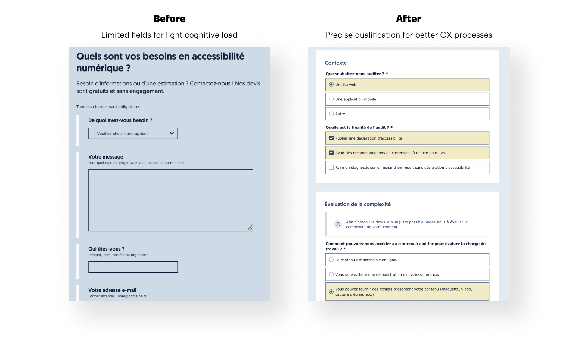
- Access42 gets more qualified requests, with better context up front
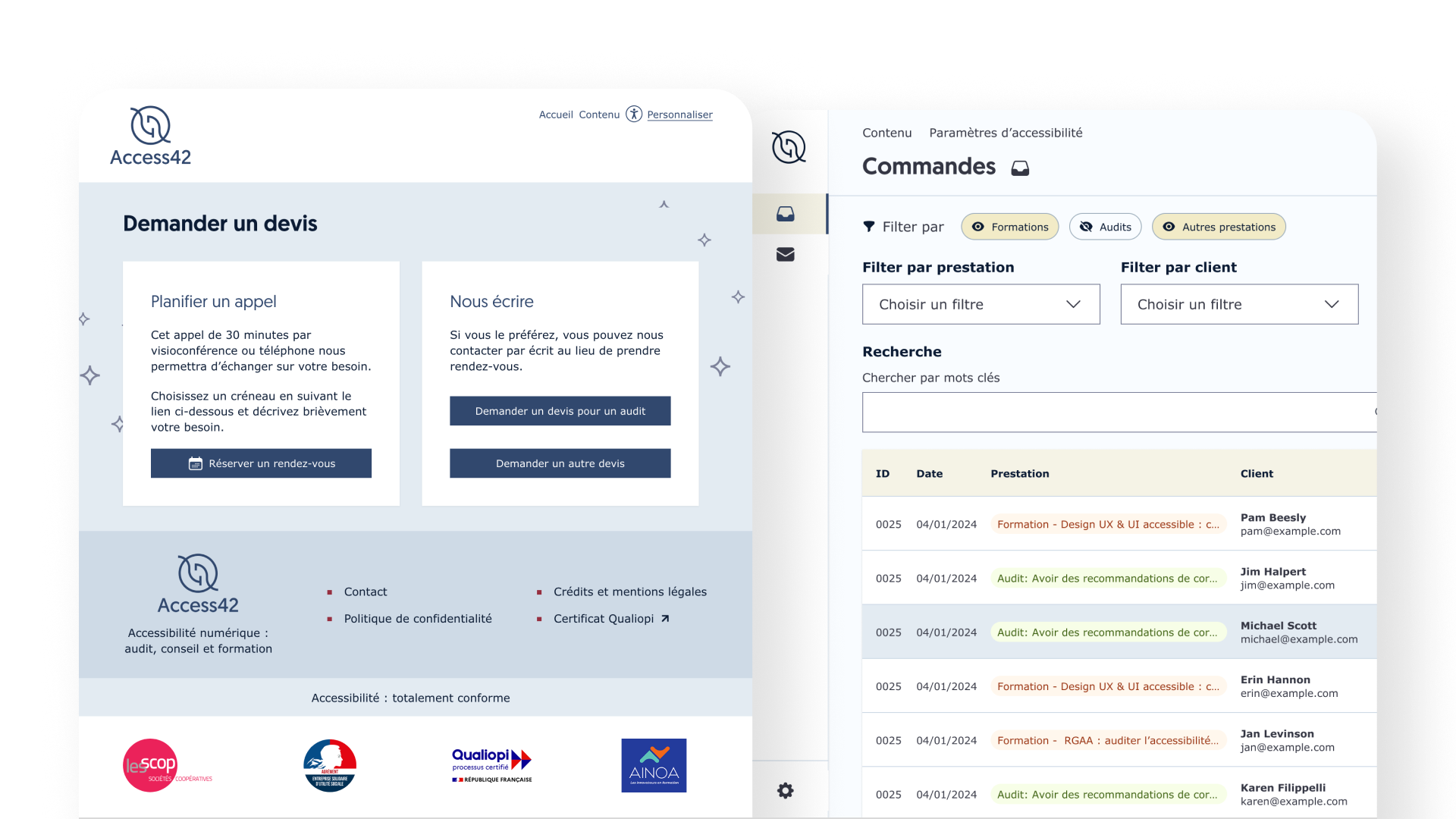
- Admins get a centralized dashboard to manage incoming requests
When success creates new opportunities: Access42’s improved CX methodology
Access42 is a French cooperative committed to driving progress in digital accessibility in France but also across Europe and the French-speaking world. Since 2014, they’ve helped public and private organizations improve their digital services for people with disabilities through audits, consulting, and training. They even coordinated the French translations of WCAG 2.1 and 2.2. So when I was asked to redesign their quote request flow, I was thrilled.
With more and more requests coming in each week, the team realized their simple contact form could be improved to match their growth and maintain a smooth experience. They aimed for a system that could qualify leads effectively and simplify meeting scheduling.
Accessibility isn’t a feature, it’s a necessity for people with disabilities
I was responsible for the design phase of the project led by Kayro AI. From the start, accessibility wasn’t treated as something to “check later”, it was part of every decision to make the website usable for people with disabilities. I’d received accessibility training from one of Access42’s own experts, and that foundation shaped how I approached everything from component structure to copy.
We took a shift-left approach, bringing accessibility into the design process as early as possible. I stayed in close contact with the developer to ensure technical feasibility, and the accessibility experts at Access42 reviewed every Figma iteration. Later, during development, they flagged additional improvements via GitHub. That level of collaboration helped us avoid costly fixes later, and ensured the final product was accessible by design.
How I designed for accessibility
Here are some examples of the choices I made in the design phase.
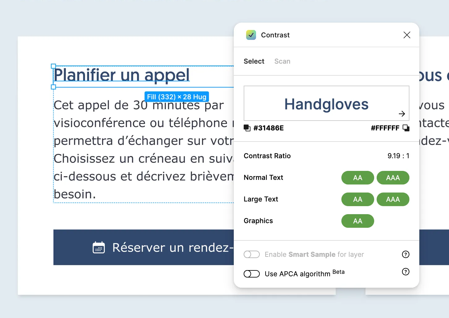
1. Clear visual contrast
All non-decorative elements met WCAG AA contrast ratios. For example, blue titles had a contrast ratio of 9.19:1.
Intent: People with low vision or color blindness can read content more easily.
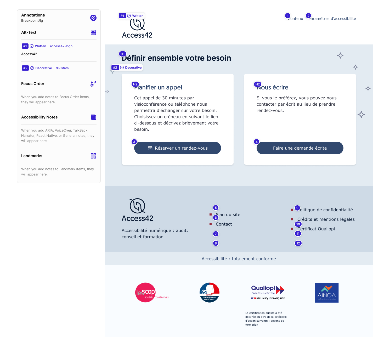
2. Focus order and semantics
In Figma, I annotated focus order, semantic HTML elements, and alt text using Stark. Every decorative image was marked as such. All others had meaningful alt descriptions.
Intent: Help screen reader users move logically through the content, without distractions.
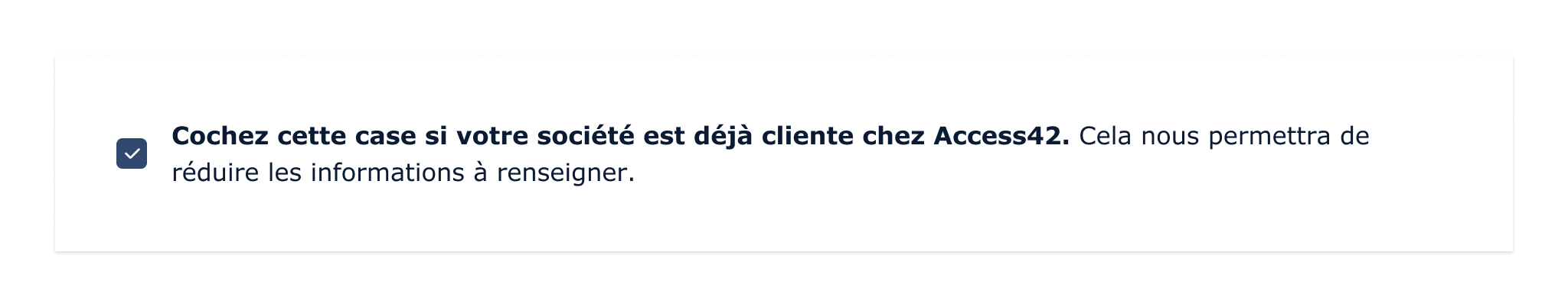
3. Reduced cognitive load and form fatigue
If someone has already contacted Access42 in the past, they can check a box and skip several form fields.
Intent: Save time and energy, especially for people using assistive tech or with cognitive impairments.
4. No color-only communication
Color was never the only way I conveyed meaning. Success states used both green and confirmation text. Icons are used alongside colors for buttons and alerts.
Intent: Ensure that information is understandable to people who don’t perceive color, by providing multiple, reinforcing cues.
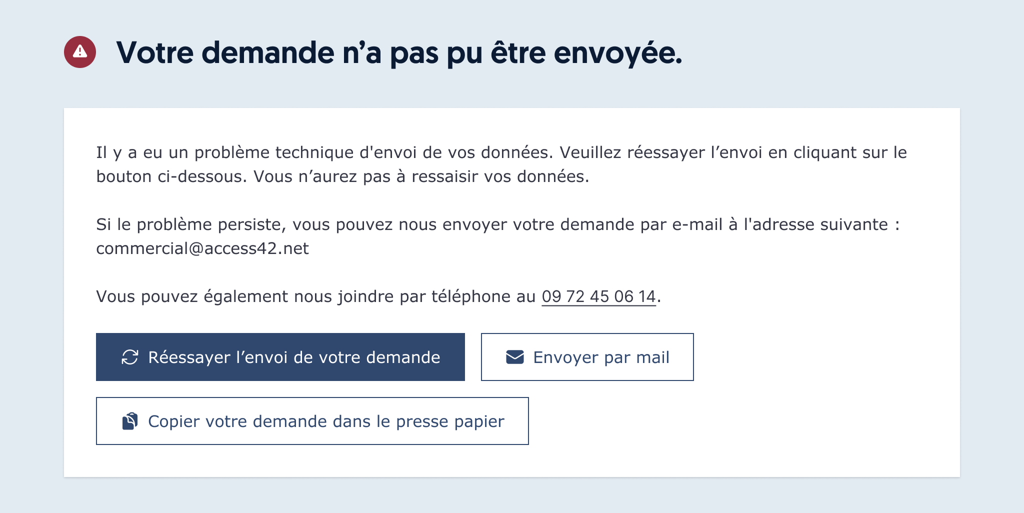
5. Explicit and actionable error states
Error messages aren't just visual. They are written to explain what to do next and they are announced to screen readers.
Our goal is to guide users toward resolving issues by explaining what happened and what steps to take next.
Intent: Support all users, including those using screen readers, in understanding and addressing errors with confidence and clarity.
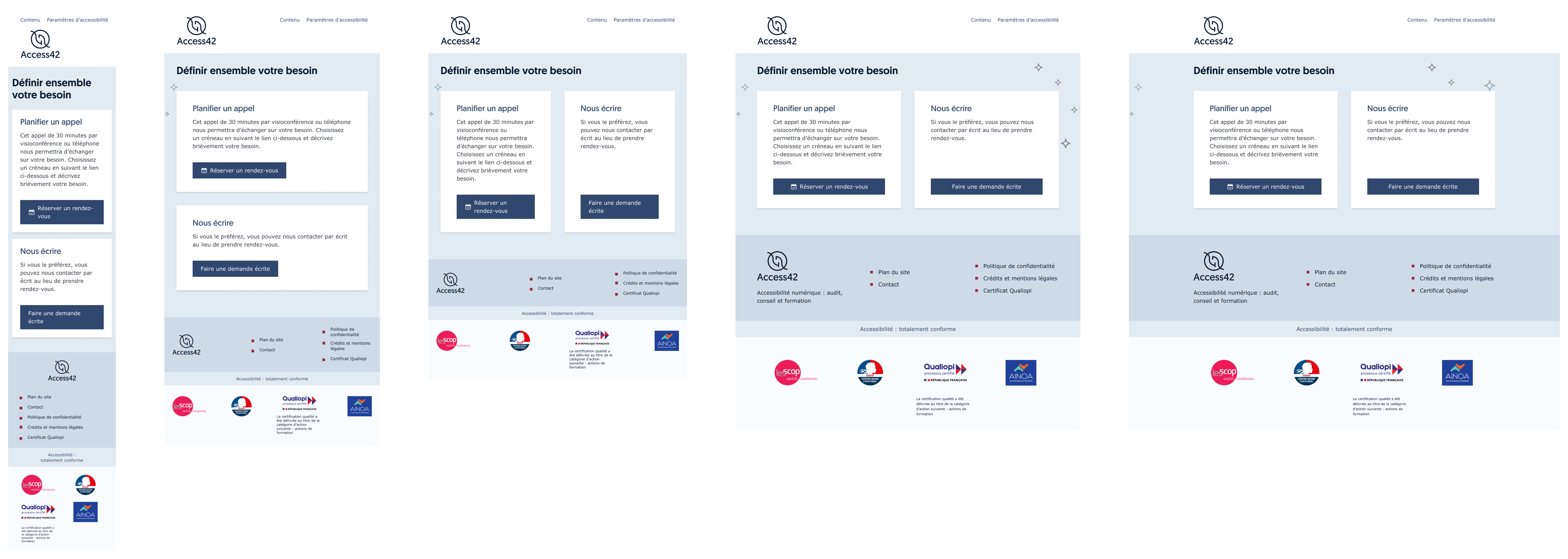
6. Responsive design
Every page was designed for five breakpoints, starting at 320px wide (to meet the WCAG Reflow criterion), while trying to reduce the complexity of layout logic between the breakpoints to facilitate the work of developers. That helped ensure everything stayed readable and usable on mobile.
Intent: A person on their phone or zooming in for better readability won’t lose content or scroll horizontally.
7. Touch-friendly interactions
All interactive targets are at least 24x24 pixels. No overlaps. No guessing where to tap.
Intent: Help people with motor disabilities can navigate more comfortably.
Takeaways
Accessibility training is essential for creating accessible products, so I encourage all designers to invest in accessibility upskilling.
This project showed me how valuable it is to bring accessibility into the design process from day one. Working closely with developers and accessibility specialists helped us catch issues early, reduce rework, and build something more usable for people with disabilities.
I’d love to see more teams work this way. It’s not harder, it’s just smarter.