Turning a fragmented UI kit into a vision-driven design system teams could trust

Situation
When I joined the Everyday Speech design team, our design system was almost non-existant. We had a Figma UI kit but most of it wasn’t re-usable in the code. We did have a few re-usable components built but designers didn’t know they existed.
Engineers and designers struggled to know how to contribute. Documentation of best practices and how to get started was non-existant. Accessibility, responsiveness, and branding were inconsistent across the platform. Without clear processes, contributions were slow, and team members were reluctant to step away from OKR work to contribute to the Design System.
As this directly impacted my work as a Product Designer, I needed a way to unify efforts, improve clarity, and make our design system a reliable tool to support the company’s mission.
Target
Our goal was simple but ambitious: create a design system that makes work faster, easier, and more confident for everyone, engineers, designers, and stakeholders alike. I wanted people to understand how to contribute, know what’s reusable, and feel empowered to improve components without duplicating effort.
I aimed to:
- Make all components accessible and responsive
- Clarify processes and responsibilities for contributions
- Build top components and design tokens that save the most time
- Integrate the system into daily workstreams without taking away from strategic work
- Improve process clarity by at least 40–50%
Result
The impact was measurable and tangible:
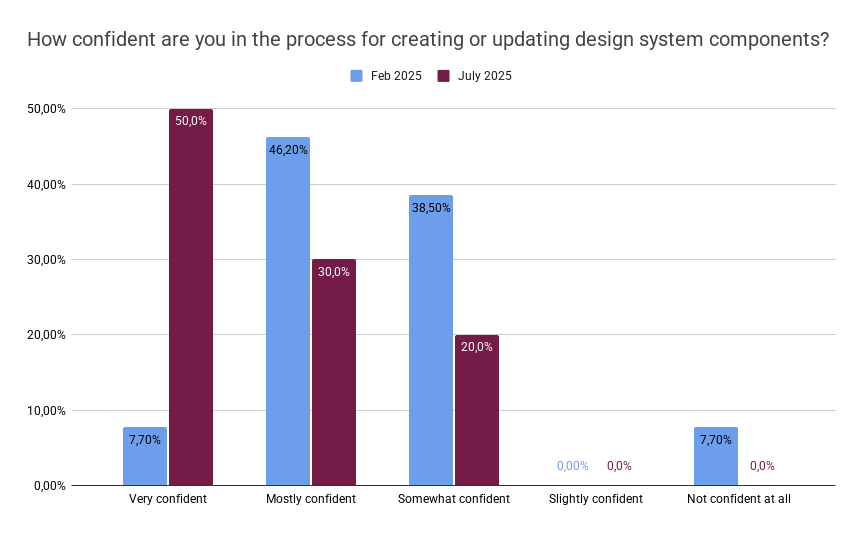
- Clarity scores improved: from 53.9% to 80% understanding of processes
- Accessibility and responsiveness issues reduced, with a strategy to get 100% of core components aligned to brand and accessibility guidelines
- Teams saved 30–60% of time on design and development tasks thanks to reusable components
- 70% reported faster accessibility and responsiveness work (30%+ time savings)
- Designers felt empowered to focus on micro-interactions, animation, and gamification rather than repetitive layout work
- Engineers felt more confident deploying updates knowing quality standards were baked in
These outcomes matched the “Definition of Done” we set in the Goal Story: a design system that’s accessible, reliable, documented, and embedded in daily workflows.
How we got there
To tackle this, I led several initiatives:
Vision & co-creation
- Facilitated workshops based on Dan Mall’s framework to define a 3-year goal story for the design system.
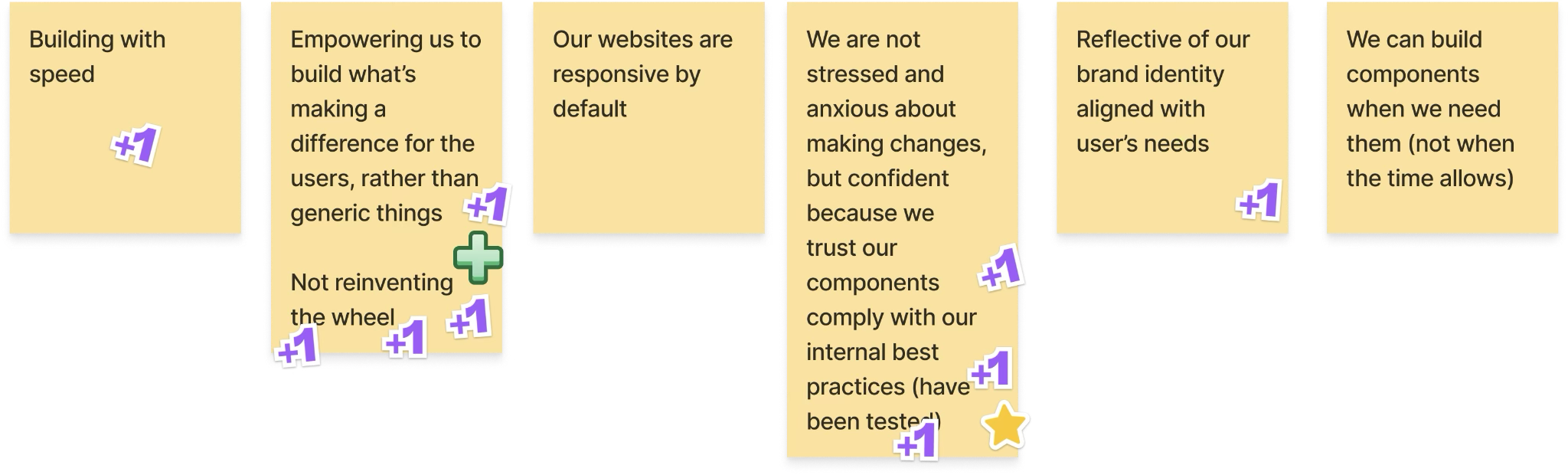
- Captured what mattered most to the engineering and design teams: fast, confident work with built-in quality, considering accessibility, technical performance, and usability, to support us in our mission of doing impactful work that would facilitate the lives of educators.
For example, I led a workshop with all the engineers, designers, and product leaders, where we identified the key themes for what we wanted our Design System to achieve.
To achieve this, we committed to three pillars.
Pillar 1: Solidify foundations
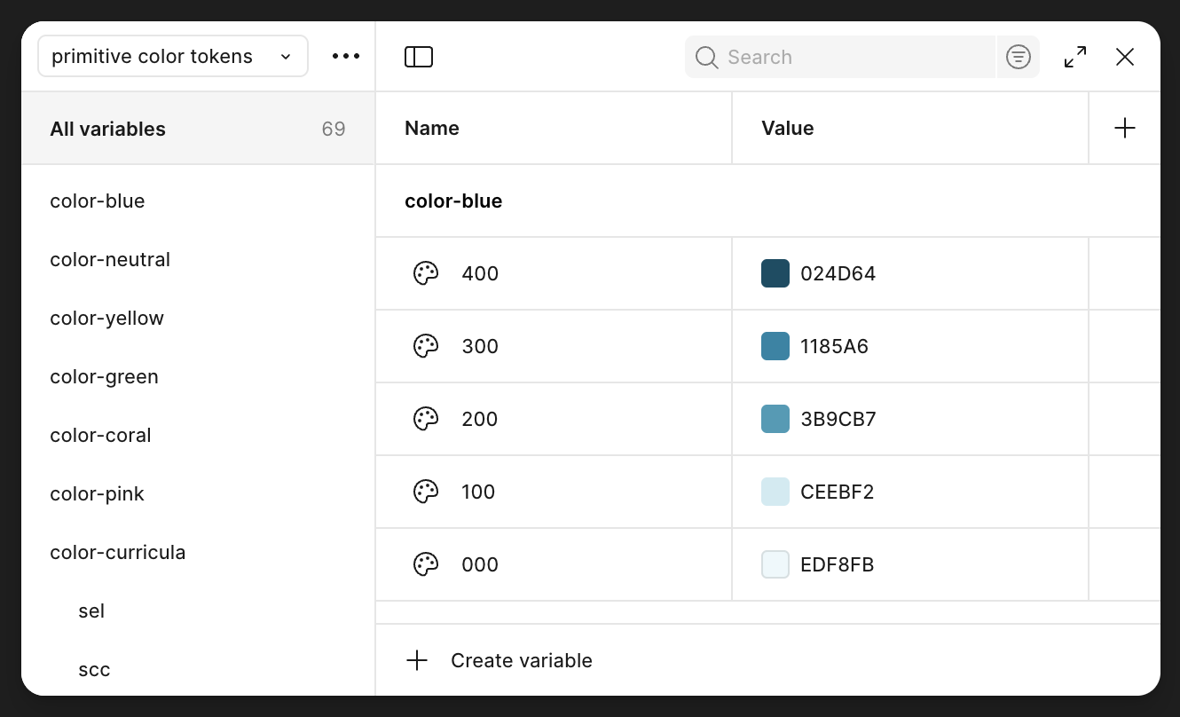
I led the efforts to establish primitive and semantic color tokens.
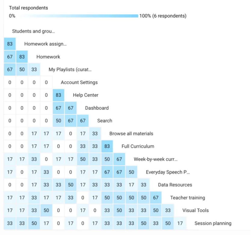
We also categorized components based on platform architecture and users’ mental models that we got from navigational card sorting exercises.
This exercise, combined with considering our product’s code infrastructure, resulted in us creating the following design system categories:
- 🎨 Foundations
- 🔨 Generic components
- ✏️ Inputs
- 🔀 Navigation
- ▶️ Session Delivery
- 🧑💼 Session Preparation
- 📊 Reporting
- ⚙️ Support
- 🔎 Content Browsing
Similarity matrix: Elements from the website's architecture that were most often paired together by card sorting participants appear with a higher opacity.
We also:
- Introduced reusable patterns for modals, spacing, and responsiveness
- Started the work to ensure typography and color tokens were applied across our two products and Design System components.
- Created Loom trainings for designers (annotations, tokens) and engineers (Dev Mode, token lookup).
- Defined and documented standard layout patterns: modals, margins, max-widths across breakpoints.
- Began work on missing tokens: elevation, border radius, and future branding updates.
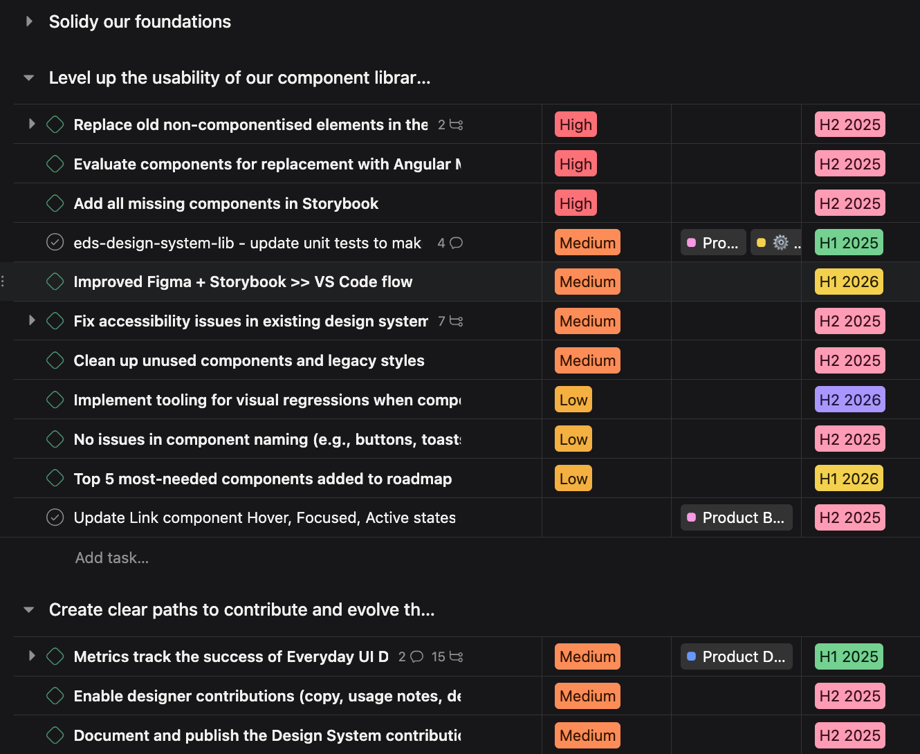
Pillar 2: Level up usability and reliability
The design system's core purpose was to make our engineers and designer's work more meaningful by freeing up their time to focus on adding value rather than re-building the fundamentals. As such, it was crucial to improve core pain points to the developer and designer experience.
- Fix Storybook compilation issues and unit test failures so engineers could rely on it.
- Automated accessibility testing with linting, Cypress, and Datadog.
- Planned visual regression tooling (Chromatic, Percy) for 2026.
- Replaced old one-off elements with system components, and evaluated Angular Material replacements for performance and accessibility.
- Ran audits to fix responsiveness and accessibility issues in existing components.
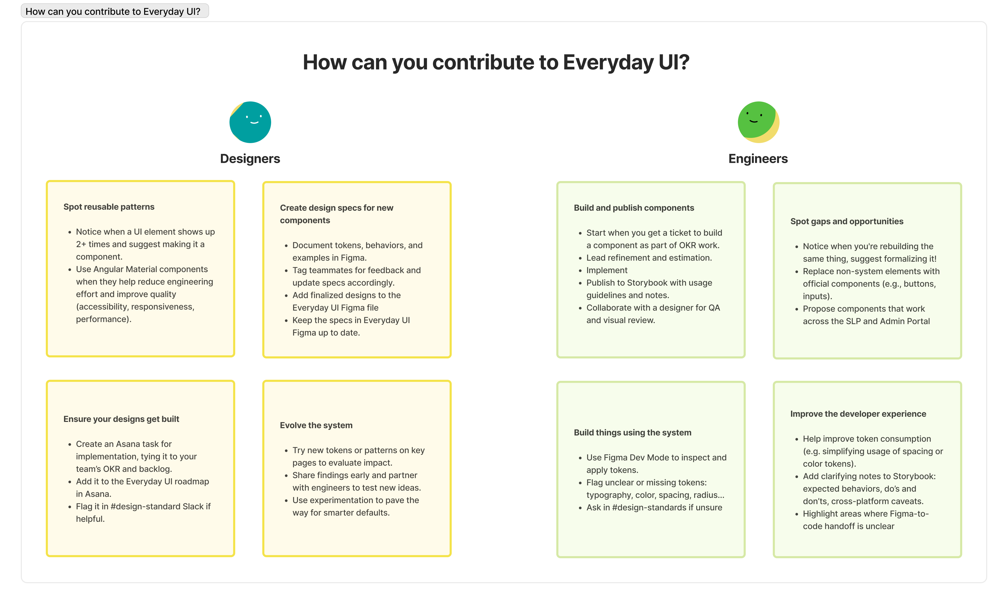
Pillar 3: Create clear paths to contribute
- Integrated the design system roadmap into Asana and established recurring rituals to ensure steady integration of impactful design system tasks into OKR work.
- Established a quarterly backlog prioritization cycle.
- Launched a #design-standards Slack channel for open discussion and contributions.
- Defined criteria for adding new components (e.g., used in 3+ places).
- Clarified and documented contribution roles for engineers and designers
- Ran clarity surveys to track improvements in understanding and confidence.
Takeaways
- Co-creation drives adoption: Involving teams early and addressing their pain points ensures buy-in and sustainability
- Small, iterative improvements matter: Clear rituals and incremental roadmap integration prevent overwhelm.
- Documentation should reflect the practical experience of building using the design system
- Metrics guide focus: Clarity surveys, adoption rates, and usage tracking highlight the most impactful actions.